How to Format and Submit Graphic Novels

Are you an agent or publisher accepting graphic novel submissions? Get the best work in your slush by giving clear submission guidelines like these

Pop Quiz

Question 1: What do you need to get your graphic novel published? (Choose all that apply)

  • A writer
  • An artist
  • A colorist
  • A penciller
  • An inker
  • A letterer
  • Thousands of fans
  • A pitch or proposal
  • An artist portfolio
  • A dummy (sketched mock-up of finished work)
  • A complete manuscript
  • A complete script in comics format
  • A completely finished, inked/colored work

Question 2: Once you’ve got everything ready, how do you get your graphic novel published?

A: Self-publish online or digitally.

B: Crowdfund and then publish using a print-on-demand company.

C: Send a query letter to an agent, who will represent you in finding a publisher.

D: Send a proposal to a comics publisher.

E: Send a proposal to a literary publisher.

Answers: Any of the above have worked in the past. It all depends. But don’t worry, I’ll do my best to demystify the best solution for your goals.

formatgnbanner

Contents

How are graphic novels published?

Graphic novels, I tell you. They’re published by comics publishers and literary publishers. They’re self-published, they’re crowdfunded, they’re submitted through agents, they’re submitted without agents. Though the medium of graphic novels has been in the literary world for decades now, writers, agents, and acquisitions editors still have no universally standard format or submission policy.

As a freelance editor for comics and graphic novels, I wanted to be able to provide these clients with a resource like the Formatting a Novel Manuscript post I made for my fiction clients. Through my research and correspondence with agents, editors, and comic creators, I’ve found a variety of submission possibilities to share with you.

Illustrated and hybrid novels

Illustrated novels are prose novels with occasional (or multiple) illustrations, like Miss Peregrine’s Home for Peculiar Children and dozens of chapter books. Their pages will look more like prose manuscripts. It’s more precise to call these “illustrated novels” in your query letter. Link to images you’re providing, or include brief illustration notes in brackets.

[Illustration: Like this]

Hybrid or multimedia novels include sections of concrete poetry, imagery or ephemera which are not supplemental, but integral. The visual aspects are meant to be read or analyzed along with the text, like IlluminaeHouse of Leaves, Extremely Loud and Incredibly Closeor Ship of Theseus. A hybrid novel might be part comic panels, part sketches, part handwritten notes, part typed prose, part photographs. If you are creating the graphic aspects of your novel, then also consider yourself the “illustrator” below.

What’s your destination?

To figure out which route you should take to get a graphic novel published, you need to understand your goal.

  • Do you want to work for a well-known comics publisher (like Marvel, DC, Image, or Dark Horse)?
  • Do you want to assemble your own team of artists, writers, colorists, and letterers?
  • Do you want to write and illustrate a graphic novel to be published with traditional literary publishers?
  • Do you just want to make the art for graphic novels?
  • Do you just want to write graphic novels?

Recommended routes for each:

If you want to work for a well-known comics publisher, you can try to get an internship, but the best way to become part of the comics world is to create an amazing portfolio of either illustration or writing samples, network with creators, and self-publish a short comic or zine by yourself or with a team of creators (see next paragraph). You can pitch your work at comic cons, recruiters can find your comics online and hire you that way, or you can join a comics community like Comics Experience, which includes a workshop and has options for publishing with IDW. Skip to the Comic Format section below to see how to format your comic scripts.

If you want to assemble your own team of creators, your first step is likely to be self-publishing. If you don’t care about being paid and just need the experience or exposure or portfolio, create a webcomic. Tapastic and Tumblr are both popular venues for webcomics, but if you have a big enough fan base, you can publish on your own website, like The Dreamer or XKCD. Some successful webcomics get book deals. Nimona, my favorite graphic novel of 2015, started as a webcomic and was published by Harper (a literary publisher—Stevenson has a literary agent). The Dreamer turned into three graphic novel volumes of comics, published by IDW (a comics publisher—Innes entered the agreement with IDW as an independent creator). Hark, a Vagrant! has gotten Kate Beaton an agent and several book deals. You might also find good success crowdfunding your graphic novel on Kickstarter. Of course, you could also become your own publisher and use a print-on-demand service to sell at cons or turn them into eBooks or PDFs to sell online.

If you want to write and illustrate a graphic novel to be published traditionally, you can do what Innes or Stevenson or Beaton did above and get your work out there first, or you can create a graphic novel proposal to send to agents. If you don’t have a complete, finished graphic novel to pitch, you’ll need a link to your portfolio (see resources in next paragraph) and a complete script.

If you want to do pencils or inks or colors, you’ll need to create an outstanding portfolio. Then you’ll do portfolio reviews to meet editors and art directors, or you’ll get an agent, who will share your work with acquisitions editors and art directors. I have heard nothing but good things about Chris Oatley’s online Painting Drama class. Oatley did character design for Disney, and his students learn how to instill deep emotional impact into their drawings and paintings–exactly what art directors are looking for. If you’d like to illustrate graphic novels and picture books for children in particular, I highly recommend KidLit411 as a resource.

If you just want to write graphic novels, you’ll need to read a lot and write a lot in your genre. Then you’ll need to write an entire script and a) query an agent to represent your script, or b) send your script to a comics publisher open to script submissions.

Graphic Novel Script and Manuscript Formats

Comic Script Formats

You may have heard of the Marvel Method, and you might have seen Alan Moore’s micromanaging scripts, but unless you are Stan Lee or Alan Moore, I recommend using Dark Horse’s suggested format. See and download a host of comic script examples at the Comic Book Script Archive and at Comics Experience’s Script Archive.

If you are really serious about writing comics, I cannot recommend Superscript enough. (This is not a paid nor requested endorsement.) Superscript is built for comics writers and has comics-specific short codes and automatic smart formatting. You can also export to PDF or Word in a number of formatting styles. It has saved me SO MANY HOURS of formatting time. See pricing and get a one week free trial.

Formats for writer/illustrators

As both writer and illustrator, you can write your script however you’d like, as long as you have a complete graphic novel to show for it or it’s legible enough for an agent to read. See how Innes and Oatley, both writer/illustrators, wrote and formatted their own scripts here. Innes uses a modified comic script, and Oatley writes his more like a screenplay. At the link, you can download their script pages and see how the script changed from draft to pencils to final colored pages.

Formats for writers seeking literary agents (and literary publishers)

If you’re looking for a literary agent and are not illustrating, read what agents are looking for below. Whether you write a more classic comics-like script or write more of a screenplay style, include golden details to guide and ground the illustrator. If you are writing real-life or historical settings or characters, add links to photos or videos for references. Tell the story through action and dialogue and, if necessary, captions. Shannon Hale, a NYT best-selling novelist, shares her style for graphic novels here (Update: this link has sadly now been removed. Check out Chris Oatley’s scripts in the previous section and read Brent’s preferences below).

What agents are looking for

If you’re wondering what comics publishers are looking for, see this Definitive List of submission guidelines.

Bree Ogden wants a query letter with a link to the script and/or artwork. She wants scripts in the comic style.

1. I look for proper formatting. Little mistakes here and there are fine. But screenplay formatting and/or prose are unacceptable. It shows me so many things, namely that you’re not familiar with the genre you want to write in.

2. Outside of formatting, I look for things like: are the captions too long? Does the dialogue in the panel give enough information without being verbose? I usually storyboard the first few pages (if it’s just a script without sample panels) and see how it pans out as an actual graphic novel. You’d be surprised how easy it is to make a mess of captions!

3. I look to see that the writer has a grasp on description and an eye for detail. This makes working with an artist so much easier.

[…]

It should look like this:

Dear Agent,

Blah blah *query letter* blah blah.

I’d love for you to take a look at the first five pages of my graphic novel script and some sample art. You can view both on my website http://www.___________.com. The password to view the script is __________.

[Closing remarks]

(Read the full article on LitReactor)


Brent Taylor wants a query with scripts written in a less formal style:

I typically prefer a query along with sample script pages pasted into the body of the message, with a link to art or samples attached as a PDF. The one thing that I will say that is more craft related is that I really like GN scripts to be written in a more “Hollywood” way. When GN writers get too caught up in art direction and minute details [like Moore’s style!] it detracts from the character and story, and I find it’s much easier to sell a GN when the script is written in a really readable manner for those who aren’t as familiar with formal comic formats.

(Source: Personal communication)

What? Bree and Brent want completely opposite things in their scripts? Bree describes a comic-like graphic novel with panel breakdowns. She probably has connections with comics publishers. Brent is looking for more prose-like graphic novel scripts, which means he’s probably not going to submit your script to comics publishers; he’s going to submit it to book publishers.

Generally agents want different things depending on whether you’re also illustrating the graphic novel.

If you are writing only, send a query letter once your script is complete and polished. Check submission guidelines to see if you can paste the first five pages below your query letter or include a link to your first five pages in your bio paragraph.

If you are illustrating and your script is complete, send a query letter with a link to your portfolio and sample pages (unless the agency requests proposals in their submission guidelines).

If you are illustrating and your script is not complete, send a cover letter and proposal (unless the agency requests something else in their submission guidelines).

Some more agent responses:

Please research agents and publishers before you submit or sign any contract. Inclusion in this post is not endorsement. I also do not update this post if/when agent wishlists change.

Editor responses:

  • Rachel Stark is accepting MG graphic novel submissions at Sky Pony Press. Email cover letter and attach complete script. If illustrating, attach first three chapters as a PDF. If your work is complete, you can include a link to your finished work.
  • McKelle George is looking for hybrid novels like Illuminae or A Monster Calls for Jolly Fish Press. She’d prefer a proposal or a link to complete work.
  • See editorial preferences for comics publishers here

Difference between a query and a proposal

Query letters are like cover letters.

A query letter is a one-page pitch addressed to an individual agent which gives the details of the story’s characters, goals, and obstacles. Don’t tell the ending, but make the reader need to know what comes next. Include a short paragraph with details about the graphic novel: title, genre, and word count (page count only if you have an idea of how your graphic novel will be laid out, and it’s within standards). Give a 1- to 2-sentence bio, and then sign the letter/email. You can send query letters to any number of agents, but address them to each personally, and before you submit, be sure to check each agency’s submission guidelines and whether they even accept graphic novels.

See an example of a successful query for a graphic novel.

If you are writing but not illustrating, only send query letters when your script is complete.

If an agent asks for samples of pages or artwork, never include attachments unless expressly asked to do so. Instead, paste text at the bottom of the email or include a link to your portfolio or pages in your bio paragraph.

Proposals are like interviews.

A proposal is a multi-page pitch which proves that you are capable of entering into a contract to complete a graphic novel. In other words, you may not have a complete graphic novel finished, but you do have a complete grasp of what you need to finish it. Check with the agency or publisher’s guidelines to see what they require. Some things you might be required to include:

  • A cover letter (generally required)—one page, addressed to appropriate person by name—who are you, what do you write or make, and why are you a good fit for this agency’s or publisher’s line-up?
  • A CV—usually optional unless you have prior publications to include
  • Synopsis (usually required)—full synopsis of what happens in the story, from beginning to end
  • Sample chapters (generally required for writers or teams)—usually 3 chapters or 10,000 words
  • Sample artwork (generally required for artists or teams)—the best pieces in your portfolio. Try to pick images which tell a story and set a scene; posed pin-ups or portraits are not the best choice for a storytelling proposal

Formatting, Submitting, and Publishing Graphic Novels | LaraWillard.com

Did you find this information useful?

  • Please share on social media! ❤
  • Consider subscribing to StoryCadet.com, my online portal for writing workshops. I offer courses in drafting, revision, and pitching/querying. By subscribing, you’ll be notified when courses will be offered.
  • If you’d like to book me for editing services, I have a page just for visual narratives (graphic novels, comics, picture books) on my editing site.

Hard-Core Manuscript Formatting

Or, Making your Typesetter Love You.

This is Part Two on my series of MS Formatting. For the basics of MS formatting, read Part One here. Get a template here in Part Three.

Remove all double spaces.

First, find and replace all double spaces with single spaces. Each period should be followed by ONE, not two, spaces.

Then do the exact same find and replace (just hit the “Replace all” button again) in case you had any rogue triple spaces lurking around.

Be consistent with your punctuation

These are the steps I go through to make sure all the punctuation is consistent. You really only have to do all of the following if you’re a typesetter, are perfectionist or anal retentive, or are trying to woo your publisher’s typesetter.

Publishers have their own style guides, but at least in terms of punctuation, it looks like American Publishers model their styles after the Chicago Manual of Style.

I recommend using the “Easiest Options” below while drafting your manuscript, and then doing a find/replace while revising and rewriting.

Ellipses (…)

  • Easiest option: three periods without spaces (d…b)*
  • Word’s auto-formatting: an ellipsis special character (d…b)*
  • AP style: three periods with a space before and after (d … b)
  • The Chicago Manual of Style‘s preferred option: three periods with five spaces (d . . . b)

*If you do either of these options, get in the habit
of typing a space before and after (
d … b).

The problem with CMOS’s favorite is that those internal spaces need to be non-breaking spaces, otherwise if the ellipsis falls at the end of the line, it might look like this .
. .

. . . which is really horrible typography. If you’re typesetting an actual book, do not use the ellipsis special character. Use periods with non-breaking spaces. (In Word: [Option][Space], on PC: [Ctrl][Shift][Spacebar], in Adobe: [Command][Option][X] for Mac or [Ctrl][Alt][X] for PC).

If you’re submitting a manuscript, it doesn’t really matter what you do (three periods, three spaced periods, or the ellipsis special character) as long as you are consistent and use a space before and after the ellipses.

However . . . when ellipses are used with quotation marks, you delete the space between the ellipsis and the quotation mark:

“Trailing off . . .” not “Trailing off . . . “

“. . . continuing.” not ” . . . continuing.”

Again, whatever method you use for ellipses, be sure you are consistent. Even if you use the auto-formatting that switches periods to the ellipsis special character, some triple-periods might still be hiding somewhere.

Em-dashes

I have a Quick and Easy Guide to Dashes if you need a primer on the differences between hyphens, em-dashes, and en-dashes and when to use them. Note that in monospaced typefaces like Courier, all dashes have the same width. An em-dash will be indistinguishable from a hyphen. I recommend using two hyphens if you will be editing or revising in Courier.

  • Easiest option: two hyphens without spaces (d–b)
  • Word’s (inconsistent) auto-formatting: an actual em-dash, with no spaces (d—b)
  • AP style: an em-dash surrounded by spaces (d — b)
  • Poorly advised attempt at making AP style prettier: an en-dash surrounded by spaces (d – b)
  • The Chicago Manual of Style’s preferred option: either two hyphens or one em-dash, no spaces. Be consistent!

Changing inch marks ″ to smart quotes “”

Say you use an online program (or app) for drafting, but you revise in a desktop program like Word. Sometimes switching between text editors really screws with your paragraph breaks and quotation marks. Quotation marks should be curved, like micro sixes and nines (“”, zoomed in: 66 99) not straight lines, which are actually inch marks (″, zoomed in: ||  ||).

If you’ve only used one word processor for the duration of your draft, your quotation marks should be consistent. You can turn on auto-format by following these instructions.

If you already have all the quotation marks typed, find/replace all automatically by typing ” into both the find and replace boxes and selecting “Use wild cards” before hitting “replace all.” Some might format awkwardly, so be sure to have a proofreader look for wacky smart quotes or replace each one at a time.

Repeat for foot marks ‘ and prime ′ to turn them into apostrophes ’ or single quotes ‛ and ’

If you cannot fix the quotation marks automatically, then you’ll have to do several Find/Replace searches. But first you need to search for all soft returns / line breaks / carriage returns (see below) in your document and replace them with paragraph breaks.

Once you are sure all of your paragraph breaks are consistent, follow the F/R searches below to manually fix all of your quotation marks:

  1. Find: [space][“] Replace: [space][left curly quote “]
  2. Find: [paragraph break*][“] Replace: [paragraph break][right curly quote ”]
  3. Find: [“][paragraph break] Replace: [left curly quote “][paragraph break]
  4. Find: [“][space] Replace: [right curly quote”][space]

Repeat for double prime ″ and foot marks ‘ and prime ′

*see below for codes

Awkward invisibles

Sometimes if we use different word processing programs while typing, the programs will use a line break instead of a paragraph break. Line breaks are also called carriage returns or soft returns.

For consistency, change them all to a paragraph breaks.

In Word, here are the codes you’d enter into the find/replace boxes:

  • Find line breaks: ^l or ^11
  • Replace with a paragraph break: ^p

In Open Office, the code for a paragraph break is [/n]. In Pages, select the invisibles from the drop down menu.


MS-format

Formatting your Novel Manuscript

How do I format a manuscript? | Novel Formatting from Editor Lara Willard

Contents

Choosing a Font
Emailing Requested Pages
Formatting your Manuscript
Keeping Punctuation Consistent
Receiving an Offer of Representation

Choosing a Font

The choice of font for your manuscript is one that’s been made for you. You need to use 12 pt. Times New Roman, double-spaced.

The size 12 font and double spacing is non-negotiable. The typeface is. Still, after asking dozens of literary agents about their preferences, I urge you to choose Times New Roman.

Why TNR?

Personally, as a typesetter, reader, and graphic designer, I loathe Times New Roman. But here’s why you should use Times New Roman for standard manuscript formatting:

  1. I polled 20 agents, and all of them accept TNR. Not so with other fonts.
  2. It’s standard. It’s been the standard since TNR was the default typeface installed on home computers.
  3. It’s a serif font. Publishers prefer serif fonts, and that preference has carried over to literary agents. It’s what we associate with books.
  4. It’s available on any device or browser. There are only two serif typefaces available on any browser or device: Times New Roman and Georgia. If you use any other font, there’s a definite chance that your recipient’s device won’t have the font and will switch it to TNR. You might think “Well, that’s fine. It switches for them.” But every time I get a manuscript in Cambria (the current default typeface for Word), I get a little pop-up that says “An Error Occurred” that I have to acknowledge and close. Yes, most agents will have Cambria on their computers, but Mac users might not, and it’s still not considered a web-safe font.
  5. TNR is very easy to read or change on e-reading devices. Many agents now read requested partials and fulls on Kindles or tablets. Times New Roman is easily changed into the typeface and size of their preference.

Courier has been a standard since the days of snail-mail manuscript mailing because, as a monospaced font, it yields approximately the same number of words per page. It has serifs (though it’s technically a slab serif), and it’s available on any device or browser. I prefer Courier while editing because it gives the most white space. My eyes are used to it, and it feels natural. I also know that I’m in “editing mode” whenever I’m reading Courier. However, some agents passionately hate Courier. They aren’t going to reject you because of your font, but they will switch it to something else, likely Times. Courier is also not easy to read on e-readers.

Bottom line:

Write in whatever font you darn well please. You could type in Webdings if it will help you from revising while getting out your first draft. Revise in something legible: a serif, a monospaced slab (like Courier), even a sans-serif (like Arial). Before you submit to agents, revise one last time in a typeface from a different family—you’ll be surprised how many things you catch when the words aren’t always in the same position on the page! Submit to agents using 12 pt TNR, double-spaced, unless they’ve stated differently in their agency guidelines.

Pasting Pages in the Body of the Email

Word uses a bunch of formatting that doesn’t always translate to web use, like italics, non-breaking spaces, space after paragraphs, double-spaced lines, and centered text. It’s always a good idea to strip the formatting for blog posts or emails, either by putting it into a text-only program like Notepad or TextEdit or by choosing “use destination formatting” while pasting. I hold down shift while pasting: shift+control+V

My pages will have a consistent look with my query letter, rather than be in a different font or format. Then I make sure there are spaces between my paragraphs, so it doesn’t look like one huge blob of text.

I’ve received pasted pages that weren’t stripped of formatting. Sometimes the spaces between words are gone. Sometimes the text is in one single horizontal line that scrolls on to the right, forever. Sometimes the query is gigantic or microscopic in comparison to the pages. Make it easy on the agent to read your pages. Don’t give him or her an easy way to say no.

Emailing Requested Pages

Subject Line

If you are emailing requested pages to an agent—that is, an agent asked you to send him or her pages after you queried—your subject line should be obvious that you are replying with requested materials.

A subject of Partial Request: BOOK TITLE Age Category Genre is a good starting point.

I’d reply to the email that they sent. An agent might mark your initial query email as important, reply directly to that (re: Query: CYCLES MG Fantasy) with a request for pages, and then if you reply to their email (re: Query: CYCLES MG Fantasy), your new email, because it’s part of the same thread, will also be marked as important.

However, if you’re replying to something they rejected, then your reply will also be marked as rejected. Resist the urge to send a “thank you” or “what about this other manuscript?” reply. If rejected, you can query with another manuscript in 6+ months. If you got a revise and resubmit, resubmit in 6+ weeks.

Content

Be professional, polite, and concise.

Dear Mr. Agent,

I am delighted to send you these pages you requested. Below I have included my initial query letter.

I look forward to hearing back from you.

Sincerely,

Your Name

[Initial query letter—the same one sent to this specific agent—pasted without formatting]

Make sure you are following agency guidelines. Don’t attach pages if they want them pasted in the body of the email. If they request your query or a synopsis as separate files, follow their instructions!

Naming your Document

When sending a partial or full request to an agent, name your document Surname_TITLE_Partial or Surname_TITLE_Full (including the .doc extension). That way, if an agent saves your document to her computer or e-reader, she will immediately know 1) what and whose it is before she opens it, 2) the query that got her interested, and 3) where to send her response if she lost your initial e-mail.

Formatting your Manuscript

Start out with 1-inch margins all around and left (not justified) alignment.

Page i—The Query Letter

Paragraph Style: “Title Page”—12 pt TNR, single-spaced, no indent

Because many agents read requested pages on e-readers, they may have forgotten your query when they start reading your pages. I recommend including your query in the body of the email (see above) as well as before the title page of your requested pages.

Use 12 pt. Times New Roman, single-spaced with an extra space between paragraphs (like your email query). Make sure you are sending the same query you sent the agent originally. Don’t send a partial to Ms. Sally Agent with a query to Mr. Hans Agent, listing the specific reasons why you want him as your agent!

Then insert a page break.

How to Format your Novel Manuscript and Query Letter

Page ii—The Title Page

This page should be in the same paragraph style, with no headers.

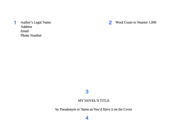
1. Include your contact information, especially your email and a reliable phone number. Agents offer representation over the phone! But they will email you to let you know if they’d like to call you, so you can schedule a time.

2. After you type your name, add a tab stop with a right alignment to your ruler on the right margin. Then enter your word count, rounded to the nearest 1,000. If text keeps dropping to the next line, make the tab option a decimal alignment.

3. Halfway down the page, include your title in all-caps. Keep it in 12 pt. font, and do not bold, italicize, or underline it.

4. Two lines down (or one line, if you double-space this part), include your name as you’d like it to appear on your cover. Note that if your legal name is Steven King, you will probably need a pseudonym to avoid confusion with the famous SK.

Then insert a section break.

How to Format your Novel Manuscript and Query Letter

Your Manuscript

Page one of your manuscript and following pages will have the same formatting.

Be sure to include your header in the header section, not in the body of the page.

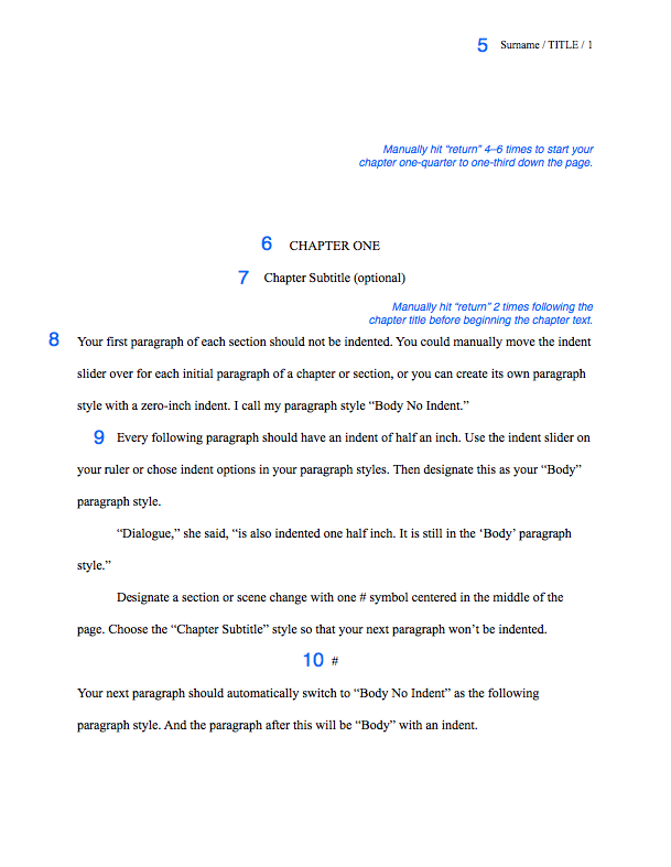
5. Headers should include your surname (whichever surname you have been using in your correspondence with the agent), an abbreviation of your title (if it’s longer than 3 words), and the page number (insert the page number). The page number will automatically show as 2 or 3. In your section settings, change the page numbering to start at 1. Learn how for Word. In Pages, in your inspector window, chose Layout > Section > Start at 1.

I prefer headers to be aligned on the right side so my eyes don’t have to skip over them every time I scroll down or flip to the next page.

Paragraph Style: “Header”—10 or 12 pt. TNR, right aligned

How to Format your Novel Manuscript and Query Letter

6. Manually hit “return” 4–6 times to start your chapter one-quarter to one-third down the page.

Paragraph Style: “Chapter Title”—12 pt. TNR, center alignment, all-caps, no indent, following paragraph style: “Chapter Subtitle” (if using), otherwise “Body No Indent”

7. If you have a chapter subtitle, put it on the next line down.

Paragraph Style: “Chapter Subtitle”—12 pt. TNR, center alignment, Title Capitalization, no indent, following paragraph style: “Body No Indent” 

8. Manually hit return 2 times before beginning your first paragraph. Do not include drop-caps or decorative initials.

Paragraph Style: “Body No Indent”—12 pt. TNR, left alignment, no indent, following paragraph style: Body (default)

9. Each subsequent paragraph should have a half-inch first line indent using the ruler, not a tab key. Highlight this indented paragraph, right-click on the default “Body” paragraph style, and select “Redefine style from selection.” Note that if anything else had been set as Body before now, its style will change.

Paragraph Style: “Body” (default)—12 pt. TNR, left alignment, 0.5″  indent

Use the indent formatting set to 0.5″. DO NOT USE THE TAB KEY or type five sentences to indent your first line. If you have done this, set your paragraphs to indent automatically. Then find/replace all tabs by typing “^t” into “find” and leaving “replace” blank. You’ll do the same with double spaces after each sentence.

Unless you are typing on a manual typewriter, indents should come from formatting, not the tab key or the space bar.

Unless you are typing in a monospace or typewriter font like Courier, do not hit space twice after each sentence.

10. Separate scene changes with a hash (#) or three asterisks (***), centered, in either of the Chapter title/subtitle styles, whichever one has the following paragraph style set as “Body No Indent.”

11. (not pictured) For long quotes, excerpts, or letters: Indent one inch on both the left and the right side for long quotes. These can be single or double-spaced. Either way, they need an extra line break both above and below, to set them apart from the rest of the body. They can also be italicized. Personally, I’d italicize only if the text were a “letter” from one character to another.

Paragraph Style: “Long Quote”—12 pt. TNR, left alignment, right indent 0.5″, left indent 0.5”

Dear Reader,

This is a letter or lengthy handwritten note (longer than a few words). Indent 1/2 inch on both sides (I prefer 1 inch). Short handwritten notes can be formatted like signs, below.

Don’t put these in different fonts. Let your designer choose typefaces.

For signs or short handwritten notes: Include an extra line break before and after, and center the text without an indent.

FOR SALE: apples
Come ‘n get ’em!

For text, instant, or direct messages: Indent a half inch on both sides using the ruler settings. For a dialogue or back-and-forth messages, I like to right-justify the POV character and left-justify anyone else. How you designate the characters’ identities is up to you. Note: In verse novels, authors will often continue the main character’s voice on the left and other character’s words will be on the right.

Friend: Hey.

Me: Hi.

Here’s a long message that
we’ll add line breaks to so
it looks more like a text.

Yeah. I think my phone only
allows like 32 characters per
line or whatever. But 6ish words
is about right, too. Really you
can add line breaks wherever,
like poetry.

I created a new message here
by hitting “enter” like usual.
Enter line breaks by holding
shift while you press “return.”
You’re adding a line break, not
a new paragraph.

If you’re typesetting an actual
book and not submitting a MS,
then I still recommend right-
justifying single-line texts,
like the “Hi” above, but…

For longer text messages, left-
justify and indent 4 or 5 inches. That way you avoid awkward short lines on the right side of the page, like the “like poetry” above.

You don’t have to add line breaks if you indent this far, but you might want to just in case someone accidentally removes
all indents.

Otherwise your text messages will just look like normal text again. Pro tip: write the message and edit it before figuring out formatting, otherwise you’ll be spending too much time prematurely adding and removing line breaks.

Miscellaneous

DO NOT add two spaces after a period unless you’re submitting in a monospaced font like Courier (which you shouldn’t; see above)

DO NOT hit the return or enter key after each line of prose. On a computer, the words will wrap automatically. For poetry or verse, then yes, you can manually add line returns.

DO insert a page break after each chapter.

DO NOT use the “tab” key or type five sentences to indent paragraphs (see #9)

DO NOT add an extra space between paragraphs when double-spaced (see #9)

DO add an extra [vertical] space between paragraphs when single-spaced (e.g., the query email). Hit the return key twice.

DO NOT use bold or underlining for emphasis, unless typing in Courier. Only use italics, and use sparingly. If you paste into an email, check to make sure the italic formatting transferred over.

DO NOT include epigraphs, song lyrics, or poetry set apart before the first chapter. Agents want to read your words, not someone else’s. You can discuss epigraphs and the like when writing your dedication and acknowledgments. More info here.

Congratulations! As a reward for reading the miscellany, go here to download my free template for the MS standard format.

Keeping Punctuation Consistent

Inconsistent punctuation isn’t going to be a deal-breaker, but if you want to ensure that your punctuation is consistent (specifically your ellipses, dashes, and quotation marks), read Part 2: Hard-core Manuscript Formatting.

Receiving an Offer of Representation

Read “When an Agent Requests your Manuscript”  by Susan Dennard (now a NYT bestselling author!) at Let the Words Flow for advice on what to do when an agent offers you representation, especially if you still have pages being reviewed by other agents.

Did you find this information useful?

Subscribe to my blog! Writing courses and editing services are on hiatus while I complete my MFA.