
Contents
Choosing a Font
Emailing Requested Pages
Formatting your Manuscript
Keeping Punctuation Consistent
Receiving an Offer of Representation
Choosing a Font
The choice of font for your manuscript is one that’s been made for you. You need to use 12 pt. Times New Roman, double-spaced.
The size 12 font and double spacing is non-negotiable. The typeface is. Still, after asking dozens of literary agents about their preferences, I urge you to choose Times New Roman.
Why TNR?
Personally, as a typesetter, reader, and graphic designer, I loathe Times New Roman. But here’s why you should use Times New Roman for standard manuscript formatting:
- I polled 20 agents, and all of them accept TNR. Not so with other fonts.
- It’s standard. It’s been the standard since TNR was the default typeface installed on home computers.
- It’s a serif font. Publishers prefer serif fonts, and that preference has carried over to literary agents. It’s what we associate with books.
- It’s available on any device or browser. There are only two serif typefaces available on any browser or device: Times New Roman and Georgia. If you use any other font, there’s a definite chance that your recipient’s device won’t have the font and will switch it to TNR. You might think “Well, that’s fine. It switches for them.” But every time I get a manuscript in Cambria (the current default typeface for Word), I get a little pop-up that says “An Error Occurred” that I have to acknowledge and close. Yes, most agents will have Cambria on their computers, but Mac users might not, and it’s still not considered a web-safe font.
- TNR is very easy to read or change on e-reading devices. Many agents now read requested partials and fulls on Kindles or tablets. Times New Roman is easily changed into the typeface and size of their preference.
Courier has been a standard since the days of snail-mail manuscript mailing because, as a monospaced font, it yields approximately the same number of words per page. It has serifs (though it’s technically a slab serif), and it’s available on any device or browser. I prefer Courier while editing because it gives the most white space. My eyes are used to it, and it feels natural. I also know that I’m in “editing mode” whenever I’m reading Courier. However, some agents passionately hate Courier. They aren’t going to reject you because of your font, but they will switch it to something else, likely Times. Courier is also not easy to read on e-readers.
Bottom line:
Write in whatever font you darn well please. You could type in Webdings if it will help you from revising while getting out your first draft. Revise in something legible: a serif, a monospaced slab (like Courier), even a sans-serif (like Arial). Before you submit to agents, revise one last time in a typeface from a different family—you’ll be surprised how many things you catch when the words aren’t always in the same position on the page! Submit to agents using 12 pt TNR, double-spaced, unless they’ve stated differently in their agency guidelines.
Pasting Pages in the Body of the Email
Word uses a bunch of formatting that doesn’t always translate to web use, like italics, non-breaking spaces, space after paragraphs, double-spaced lines, and centered text. It’s always a good idea to strip the formatting for blog posts or emails, either by putting it into a text-only program like Notepad or TextEdit or by choosing “use destination formatting” while pasting. I hold down shift while pasting: shift+control+V
My pages will have a consistent look with my query letter, rather than be in a different font or format. Then I make sure there are spaces between my paragraphs, so it doesn’t look like one huge blob of text.
I’ve received pasted pages that weren’t stripped of formatting. Sometimes the spaces between words are gone. Sometimes the text is in one single horizontal line that scrolls on to the right, forever. Sometimes the query is gigantic or microscopic in comparison to the pages. Make it easy on the agent to read your pages. Don’t give him or her an easy way to say no.
Emailing Requested Pages
Subject Line
If you are emailing requested pages to an agent—that is, an agent asked you to send him or her pages after you queried—your subject line should be obvious that you are replying with requested materials.
A subject of Partial Request: BOOK TITLE Age Category Genre is a good starting point.
I’d reply to the email that they sent. An agent might mark your initial query email as important, reply directly to that (re: Query: CYCLES MG Fantasy) with a request for pages, and then if you reply to their email (re: Query: CYCLES MG Fantasy), your new email, because it’s part of the same thread, will also be marked as important.
However, if you’re replying to something they rejected, then your reply will also be marked as rejected. Resist the urge to send a “thank you” or “what about this other manuscript?” reply. If rejected, you can query with another manuscript in 6+ months. If you got a revise and resubmit, resubmit in 6+ weeks.
Content
Be professional, polite, and concise.
Dear Mr. Agent,
I am delighted to send you these pages you requested. Below I have included my initial query letter.
I look forward to hearing back from you.
Sincerely,
Your Name
[Initial query letter—the same one sent to this specific agent—pasted without formatting]
Make sure you are following agency guidelines. Don’t attach pages if they want them pasted in the body of the email. If they request your query or a synopsis as separate files, follow their instructions!
Naming your Document
When sending a partial or full request to an agent, name your document Surname_TITLE_Partial or Surname_TITLE_Full (including the .doc extension). That way, if an agent saves your document to her computer or e-reader, she will immediately know 1) what and whose it is before she opens it, 2) the query that got her interested, and 3) where to send her response if she lost your initial e-mail.
Formatting your Manuscript
Start out with 1-inch margins all around and left (not justified) alignment.
Page i—The Query Letter
Paragraph Style: “Title Page”—12 pt TNR, single-spaced, no indent
Because many agents read requested pages on e-readers, they may have forgotten your query when they start reading your pages. I recommend including your query in the body of the email (see above) as well as before the title page of your requested pages.
Use 12 pt. Times New Roman, single-spaced with an extra space between paragraphs (like your email query). Make sure you are sending the same query you sent the agent originally. Don’t send a partial to Ms. Sally Agent with a query to Mr. Hans Agent, listing the specific reasons why you want him as your agent!
Then insert a page break.

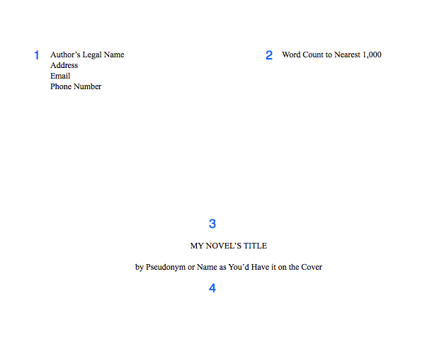
Page ii—The Title Page
This page should be in the same paragraph style, with no headers.
1. Include your contact information, especially your email and a reliable phone number. Agents offer representation over the phone! But they will email you to let you know if they’d like to call you, so you can schedule a time.
2. After you type your name, add a tab stop with a right alignment to your ruler on the right margin. Then enter your word count, rounded to the nearest 1,000. If text keeps dropping to the next line, make the tab option a decimal alignment.
3. Halfway down the page, include your title in all-caps. Keep it in 12 pt. font, and do not bold, italicize, or underline it.
4. Two lines down (or one line, if you double-space this part), include your name as you’d like it to appear on your cover. Note that if your legal name is Steven King, you will probably need a pseudonym to avoid confusion with the famous SK.
Then insert a section break.
Your Manuscript
Page one of your manuscript and following pages will have the same formatting.
Be sure to include your header in the header section, not in the body of the page.
5. Headers should include your surname (whichever surname you have been using in your correspondence with the agent), an abbreviation of your title (if it’s longer than 3 words), and the page number (insert the page number). The page number will automatically show as 2 or 3. In your section settings, change the page numbering to start at 1. Learn how for Word. In Pages, in your inspector window, chose Layout > Section > Start at 1.
I prefer headers to be aligned on the right side so my eyes don’t have to skip over them every time I scroll down or flip to the next page.
Paragraph Style: “Header”—10 or 12 pt. TNR, right aligned
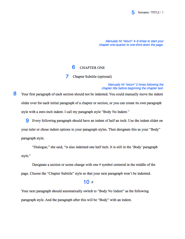
6. Manually hit “return” 4–6 times to start your chapter one-quarter to one-third down the page.
Paragraph Style: “Chapter Title”—12 pt. TNR, center alignment, all-caps, no indent, following paragraph style: “Chapter Subtitle” (if using), otherwise “Body No Indent”
7. If you have a chapter subtitle, put it on the next line down.
Paragraph Style: “Chapter Subtitle”—12 pt. TNR, center alignment, Title Capitalization, no indent, following paragraph style: “Body No Indent”
8. Manually hit return 2 times before beginning your first paragraph. Do not include drop-caps or decorative initials.
Paragraph Style: “Body No Indent”—12 pt. TNR, left alignment, no indent, following paragraph style: Body (default)
9. Each subsequent paragraph should have a half-inch first line indent using the ruler, not a tab key. Highlight this indented paragraph, right-click on the default “Body” paragraph style, and select “Redefine style from selection.” Note that if anything else had been set as Body before now, its style will change.
Paragraph Style: “Body” (default)—12 pt. TNR, left alignment, 0.5″ indent
Use the indent formatting set to 0.5″. DO NOT USE THE TAB KEY or type five sentences to indent your first line. If you have done this, set your paragraphs to indent automatically. Then find/replace all tabs by typing “^t” into “find” and leaving “replace” blank. You’ll do the same with double spaces after each sentence.
Unless you are typing on a manual typewriter, indents should come from formatting, not the tab key or the space bar.
Unless you are typing in a monospace or typewriter font like Courier, do not hit space twice after each sentence.
10. Separate scene changes with a hash (#) or three asterisks (***), centered, in either of the Chapter title/subtitle styles, whichever one has the following paragraph style set as “Body No Indent.”
11. (not pictured) For long quotes, excerpts, or letters: Indent one inch on both the left and the right side for long quotes. These can be single or double-spaced. Either way, they need an extra line break both above and below, to set them apart from the rest of the body. They can also be italicized. Personally, I’d italicize only if the text were a “letter” from one character to another.
Paragraph Style: “Long Quote”—12 pt. TNR, left alignment, right indent 0.5″, left indent 0.5”
Dear Reader,
This is a letter or lengthy handwritten note (longer than a few words). Indent 1/2 inch on both sides (I prefer 1 inch). Short handwritten notes can be formatted like signs, below.
Don’t put these in different fonts. Let your designer choose typefaces.
For signs or short handwritten notes: Include an extra line break before and after, and center the text without an indent.
FOR SALE: apples
Come ‘n get ’em!
For text, instant, or direct messages: Indent a half inch on both sides using the ruler settings. For a dialogue or back-and-forth messages, I like to right-justify the POV character and left-justify anyone else. How you designate the characters’ identities is up to you. Note: In verse novels, authors will often continue the main character’s voice on the left and other character’s words will be on the right.
Friend: Hey.
Me: Hi.
Here’s a long message that
we’ll add line breaks to so
it looks more like a text.
Yeah. I think my phone only
allows like 32 characters per
line or whatever. But 6ish words
is about right, too. Really you
can add line breaks wherever,
like poetry.
I created a new message here
by hitting “enter” like usual.
Enter line breaks by holding
shift while you press “return.”
You’re adding a line break, not
a new paragraph.
If you’re typesetting an actual
book and not submitting a MS,
then I still recommend right-
justifying single-line texts,
like the “Hi” above, but…
For longer text messages, left-
justify and indent 4 or 5 inches. That way you avoid awkward short lines on the right side of the page, like the “like poetry” above.
You don’t have to add line breaks if you indent this far, but you might want to just in case someone accidentally removes
all indents.
Otherwise your text messages will just look like normal text again. Pro tip: write the message and edit it before figuring out formatting, otherwise you’ll be spending too much time prematurely adding and removing line breaks.
Miscellaneous
DO NOT add two spaces after a period unless you’re submitting in a monospaced font like Courier (which you shouldn’t; see above)
DO NOT hit the return or enter key after each line of prose. On a computer, the words will wrap automatically. For poetry or verse, then yes, you can manually add line returns.
DO insert a page break after each chapter.
DO NOT use the “tab” key or type five sentences to indent paragraphs (see #9)
DO NOT add an extra space between paragraphs when double-spaced (see #9)
DO add an extra [vertical] space between paragraphs when single-spaced (e.g., the query email). Hit the return key twice.
DO NOT use bold or underlining for emphasis, unless typing in Courier. Only use italics, and use sparingly. If you paste into an email, check to make sure the italic formatting transferred over.
DO NOT include epigraphs, song lyrics, or poetry set apart before the first chapter. Agents want to read your words, not someone else’s. You can discuss epigraphs and the like when writing your dedication and acknowledgments. More info here.
Congratulations! As a reward for reading the miscellany, go here to download my free template for the MS standard format.
Keeping Punctuation Consistent
Inconsistent punctuation isn’t going to be a deal-breaker, but if you want to ensure that your punctuation is consistent (specifically your ellipses, dashes, and quotation marks), read Part 2: Hard-core Manuscript Formatting.
Receiving an Offer of Representation
Read “When an Agent Requests your Manuscript” by Susan Dennard (now a NYT bestselling author!) at Let the Words Flow for advice on what to do when an agent offers you representation, especially if you still have pages being reviewed by other agents.
Did you find this information useful?
Subscribe to my blog! Writing courses and editing services are on hiatus while I complete my MFA.

Reblogged this on Chris The Story Reading Ape's Blog….. An Author Promotions Enterprise! and commented:
This may seem like basic information, but it IS important 😀
GREAT info, Lara! thanks so much! this is one to file for future reference!
So helpful. Thank you for sharing. Now is this format for the e-book or the hardcopy?
This is the format you use when sending pages to an agent, either as a .doc (which they can open in their email, on their computer, or on their e-readers) or as a hardcopy.
Okay, thank you!
Reblogged this on bonniegcarter and commented:
Formatting Your Novel Manuscript on Write Lara Write
Reblogged this on theowlladyblog.
Reblogged this on MARSocial Author Business Enhancement Interviews.
Wonderful blog Lara! @v@ ❤
Reblogged this on Manuscript Tunes and commented:
All About Manuscript
Concerning DO NOT use the “tab” key. I have a completed MS where I used the “tab” key the whole time. How do I fix?
First use the formatting options to create indents, either using the slider on the ruler or the paragraph formatting options (that will depend on your word processor). Then find/replace all tabs, leaving the “replace” bar blank. If you are 100% certain that you only used the tab key to indent the beginning of each paragraph, you can “replace all,” otherwise replace each one at a time. In Word, the code for finding tabs is likely ^t.
Success! What’s the deal with using the “tab” key anyways?
The tab key works well when using lists. You can tab to increase the indent of the bullet or outline, thereby decreasing its hierarchy. It’s also good for skipping to the next box when entering text in a table or form.
Great info!
Out of curiosity, why no indent for the first paragraph of a chapter?
Thanks 🙂
The function of an indent is to show where the next paragraph starts. It’s obvious where the first paragraph starts—because it’s the first one—so it doesn’t need an indent.
Fantastic info. I’m just curious about file formats. Is there a consensus preference between .doc or docx? And some agents specifically request PDFs, while others don’t clarify. Can PDFs be sent as a common practice, or are they problematic because of the e-reader use you mention? Thanks in advance.
Hi Dan,
Agents will tell you which format they’d like it in, but .doc can be opened by anyone. The newer .docx should be openable, but always go with what they state in their submission guidelines. I prefer .doc so I can easily change fonts if someone sends me text in Comic Sans or something. Never send PDF unless it is directly stated in the submission guidelines or if you got a partial or full request or request for artwork. If the agent requested, ask if a PDF is OK.
One of the red flags with a PDF is that it tends to come from a writer who wants their book formatted their way. Book publishing is a collaborative effort, and formatting needs to be left up to the professionals. Unless you are sending a concrete poem, .doc is preferred.
Fantastic. Thanks for the clarification and explanation, Lara. This is a stressful process, and your guidelines and feedback are extremely helpful. One of the other things I wonder is why it hasn’t become common practice to send mobi’s if everyone is using e-readers. Do you think it would be wise to attach both .doc. and .mobi simply to afford them the choice in how they read? This is in reference to a first-contact query letter/sample chapters for a finished but unpublished memoir. Thanks in advance.
I don’t know any program that converts to .mobi. I have Pages and it converts to .epub.
Submit as a .doc (I’m pretty sure any ereader can open a .doc). Sending attachments that weren’t asked for may result in getting the submission deleted.
O my goodness this very helpful, but now I feel as if my whole manuscript is wrong. Everything I have read online state’s “Use courier 12 only, no TNR. Indent the first line and all first sentences of a new paragraph.” Now I read this. So my manuscript is in courier 12 and indented everywhere. Should I change the whole thing? Lord, just when I was ready to submit.
Don’t worry about the indents—that’s not officially standardized. DO switch to TNR or a similar serif font that isn’t monospaced like Courier. (Monospaced means each letter is the same width, so n and m and i take up the same amount of space)
Courier is still used when submitting scripts and screenplays, but many agents don’t like it. Many don’t care at all.
Reblogged this on Erin Willard, Copy Editor and commented:
Basic, excellent recommendations from WriteLaraWrite.wordpress.com!
Excellent advice! It’s a funny thing, the guidelines as you’ve set them out here produce something identical to the way I was taught a MS should be formatted for submission in typewriting days, when I started. I guess things haven’t changed despite the revolution in technology (I still have my typewriter, incidentally – along with the IBM Selectric Mk II that I wrote my first few books on).
Funny! One thing should have changed, though: only one space after periods when typing on anything using digital fonts. Typewriters require two spaces after periods. 🙂
A habit I did manage to break (eventually) – until then I know that one of the first things my publishers’ proof editor always did was run a search and delete for the extraneous spaces. I always tried to supply as clean as possible, knowing the file would eventually be pulled through a typesetting program, which is why I deliberately broke the double space habit.
Hi Lara, I shared this blog on Opal Publishing Facebook page. Very pertinent advice for my readers!
Thanks for sharing! Glad it can be of service 🙂
Fantastic blog! Thanks, Lara.
You’re welcome!
This is very useful. Rarely does anyone go into this degree of detail so clearly. Can I ask about one other visual cue? It’s the blank line that is used to signal a section change or a short jump in time, which has less weight than a scene break (#, style 10). Putting a blank line in the ms just seems to ask for this cue to be missed or ignored as an accident. Is that a problem in practice? Do you prefer the following paragraph to have no indent (style 8) or to have an indent (style 9)? Thank you!
Hi Doug, thanks for your kind words! For shifts in time or point of view, you’ll still do the scene break designation (# or, if you prefer, ***) for exactly that reason you stated. The layout designer will remove any of the symbols that don’t occur at the bottom of the page, once the page layout is set and your book is ready for proofs.
I cannot tell you how badly I’ve needed this article! Thank you for taking the time to write it for us newbies! I’ve saved it in three different places just in case I lose it!
You’re so welcome! Thanks for reading!
Just located this, Lara, having been given the recommendation. It’s a clear and generous explanation of what seems to a new writer a complex process of first enquiry and submission. Great advice and essential information, many thanks. Jean
Hi Jean, I completely missed this comment, but thank you so much! Best wishes in your writing.
Please recommend an editor. I need one for several pages of sample dialogue. I have a question or two with each sample.
Hi Carl,
It’s difficult to edit dialogue out of context, so you might need to have more pages read to really get the most out of an edit, but check out my colleagues at mseditors.com, who are taking clients while I am on hiatus. Best of luck!
I actually created a templet in Word titled Times New Roman where the body paragraphs are all double spaced 12 point TNR with centered headings. The only thing that’s really different is that my paragraph indents are 1/4 inch not 1/2, but I think I’m going to change this to 1/2 because this is the second time someone has said 1/2 is standard.
Quarter inch is good for printing because you save paper, but not good for reading.
Well then, there we go!
Thanks for the best advice I’ve seen in days of looking into this subject.
You’re very welcome!
I’ve seen many advocate larger titles (12-20) font and bolded. Is this okay?
How do I add a date for historical fiction (I italicized it and put it to the right)
Thanks, great tips!
Titles can be bigger and/or bolder if you want, but I wouldn’t change the typeface to something else.
For a date, I’d left-align it so it doesn’t get missed and maybe add an extra return before and after. Italicizing is optional—just be aware that it won’t always transfer if you’re pasting in an email.
Chapter 1
May 20, 1962
[start paragraph]
Hi Lara, thanks for this great post. I just finished writing a novel and I’m formatting the manuscript. The novel has supplementary items throughout such as fictional newspaper articles, medical pamphlets, emails and texts. I was planning to switch fonts for those items because it gives a clear visual cue to the reader. I don’t have to explain “this is a newspaper article” because the fonts and headlines make it look like newspaper article, ditto with the medical pamphlets and emails. If I do everything in TNR, what’s the best way to explain to agents what they’re looking at? The best I can think of is to add a footnote to each item, explaining that it’s intended to be formatted to show that it’s an article, pamphlet, etc? Or part of me wonders if I should just take the risk and use alternate fonts? For texts in particular, it feels counter-intuitive to leave them in TNR, when putting them in helvetica makes them look exactly like texts and makes their context clearer.
Do you have any advice or is there a standard for any of this? I’ve been worried about this and have scoured the internet and can’t find an answer to these questions! Thank you!
Hi Liz! I wouldn’t do footnotes because those aren’t as e-reader friendly. Likewise, some formatting and fonts won’t be transferred to e-readers or plain-text email. I think it’s fine to change your supplementary items to a plain sans-serif font like Helvetica or Arial, and I might indent those sections an inch or two to set them apart.
BUT to avoid confusion in case formatting doesn’t transfer, I’d treat the sections as new scenes, setting them apart with extra line breaks before and after, and instead of adding just a # or *, add a note describing the type of media:
(regular prose in TNR)
(blank line)
###Newspaper Article###
(blank line)
(article in plain-text Helvetica, Arial, or Calibri)
(blank line)
###End Newspaper Article###
(blank line)
(regular prose)
Make sure you are consistent (e.g., three ###) so that typesetters can easily find these sections using Find/Replace.
Thank you so much Lara! This is incredibly helpful. I really appreciate it.
Does your template contain a style for text message formatting described above? I’m trying to figure out how to do this without using the tab key. Any suggestions?
Hi Kyl. No, my template doesn’t include a style for text messages to my knowledge. I manually adjust the tab/indent slider on my ruler when adding text messages. If you don’t see a ruler, go to View > Show Ruler (depending on what program you are using). The top slider is for indenting the first line, and the bottom slider is for indenting the rest of the lines of a paragraph.
You can create your own style for text messages by following these directions in Word: https://support.microsoft.com/en-us/office/customize-or-create-new-styles-d38d6e47-f6fc-48eb-a607-1eb120dec563 and setting an indent that way. If you use Google Docs, try the options listed here: https://support.google.com/docs/thread/29527841?hl=en